ZippoGreen - Online Lighter Store
Revamped a retailer's online presence for simplified product order
Role
Design Engineer
Team
Just me 🧘
Tools
Figma, HTML/CSS, React, JavaScript, MySQL
Duration
12 weeks
GitHub
Background
ZippoGreen relies heavily on social media for sales, leading to a manual and inefficient ordering process.
ZippoGreen is a lighter retailer in Hanoi that is primarily based online through social media. While this provided visibility, the ordering process was labor-intensive: customers had to message the store directly, and staff spent significant time replying, confirming orders, and tracking inventory.
The problem
How might we give customers a more streamlined way to shop and make orders?
Research & Ideation
Interviews with the store manager revealed 2 main struggles:
The nature of social media sales created multilayered obstacles for both customers and staff, leading to reduced customer retention and productivity.
Which was the most suitable pathway?
The store manager's initial instinct was to move to Shopee, but the limitations were clear.
ZippoGreen was outgrowing social media and needed a real sales channel. The store manager wanted to switch to an e-commerce platform, but I argued the opposite, and here's why.


Join an existing e-commerce platform
passed on
✔️ Fast to implement
✔️ Familiar to users with existing accounts
✖️ Locked into their templates, checkout, and fees
✖️ No room for repair services or a local brand


Develop a dedicated website for the business
what i argued for
✔️ High scalability
✔️ Owns the brand, checkout, and roadmap
✔️ Room to add repair services later
✔️ Upfront cost beats the cost of migrating later
The trade-off
If I couldn't build it well enough, we'd waste time and have to fall back to using Facebook or Shopee.
The technical challenge
As the sole designer and developer, I knew this meant designing only what I could actually implement.
I was learning React simultaneously while building this, so every design decision faced a reality check.


The manager wanted to ship the website in 2 months. These constraints forced clarity: I couldn't hide behind unrealistic concepts.


Design decisions shaped by constraints
Technical limitations coupled with time constraints helped me define the MVP scope clearly.
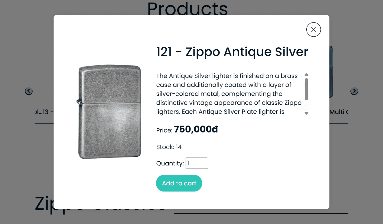
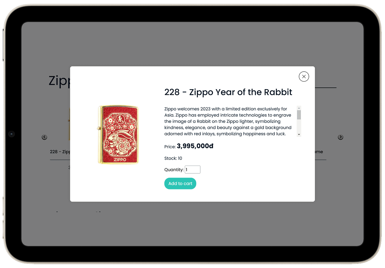
Modal-based product details instead of dedicated pages
My initial wireframes had separate pages for each product. While coding, I realized this meant managing routing, loading states, and back-button behavior, easily an extra week of work.
Switching to modals kept users in their browsing context and cut implementation time in half. The "limitation" actually reduced friction.
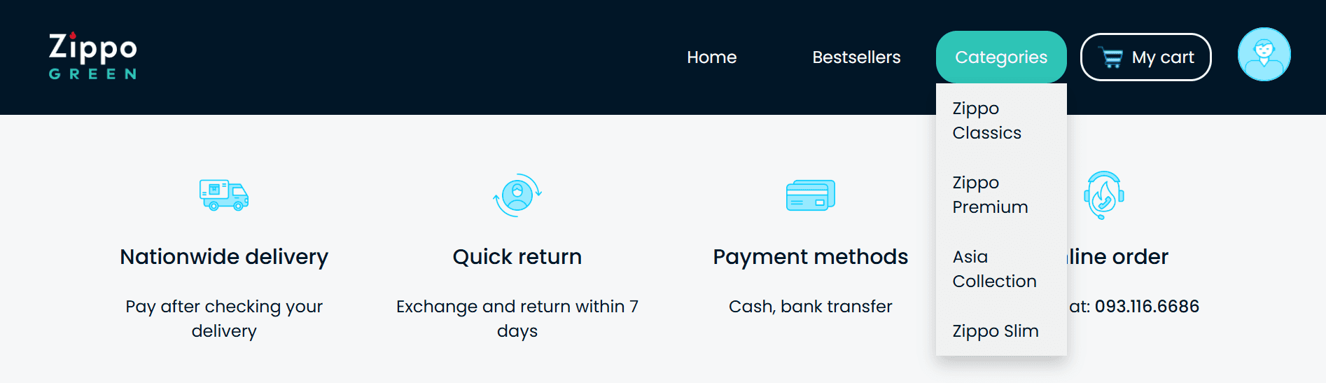
No filter or search bars
The original wireframe had a sidebar filter and search bar, but coding them would have delayed launch by 2 weeks.
Instead, I simplified the navigation during development by adding category tabs and price sorting, which solved the searchability problem with 20% of the effort.

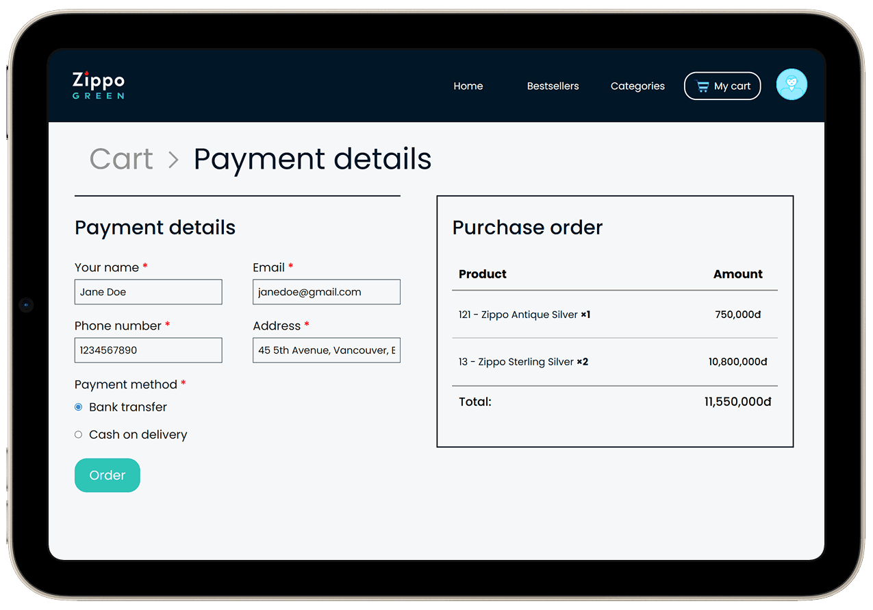
Auto-calculating cart totals instead of manual entry
This feature was non-negotiable for preventing order errors. The technical implementation (managing cart state, updating totals on quantity changes) was complex, but it eliminated the back-and-forth that happened when staff miscalculated customer orders on Facebook.

The struggle with solving two problems at once
The store manager wanted a solution for both customers and staff, but this came with a risk
The website needed to work for two completely different users: customers browsing for products, and staff managing inventory.
Early on, the store manager insisted we include an admin panel for v1
`They were worried that without it, staff would still need to manually update product availability, recreating the same communication bottleneck we were trying to solve.
I pushed back initially. Building an admin system meant:
But the manager had a point I hadn't considered:
Without live inventory sync, the site would break both ways:
brand distrust
Customers order items that are sold out, then get frustrated when staff cancel.
or
manual patching
Staff go back to cross-checking every order, leading to the same time drain we set out to fix.
The compromise I made
I built a fairly simple admin panel, just enough for staff to view orders, and add, remove, or update items.
I accepted that this would add timeline risk, but the alternative was launching a half-solution that could damage trust with their existing customer base.


My solution
A dynamic, operational e-commerce website for ZippoGreen.
Outcome
The website didn't launch, and that taught me more than shipping would have.
The project took longer than anticipated. As I was learning while building, implementation stretched beyond the store's timeline. They needed something operational immediately, so they hired a professional developer to rebuild it.
Reflection
This felt like a failure at the time. In hindsight, it was a highly valuable lesson.
ZippoGreen was the first web-based project that I developed from scratch, and it taught me the challenges in transferring design into code to ensure consistency and practicality. Therefore, my design focus for this project was technical feasibility rather than aesthetics, which allowed me to learn a lot about how information architecture and user interactions are implemented.
This experience has allowed me to better understand engineers' workflow and technical capacities, which I hope will help me collaborate with them more effectively in cross-functional teams.
What I’d do differently
TIMELINE ESTIMATion
I underestimated how long authentication and database setup would take. This experience completely changed how I work with engineers now: I would ask about implementation complexity early, not after designs are finalized.
User Acceptance Testing
I assumed categories that made sense to the store would work for shoppers, but never validated that. We might have discovered customers think in terms of price range or occasion, or if a different approach is needed to improve searchability.